Mobile Design
Hulu Redesign - Finding & Navigating
Hulu is a leading streaming service with over 40 million subscribers, offering a vast library of TV shows, movies, and live TV. However, despite its extensive content, the mobile app suffers from navigational challenges and unintuitive design, particularly for university students. These users, who make up a significant portion of Hulu’s subscriber base, often face decision paralysis due to excessive scrolling, hidden features, and a lack of personalization. The problem we aimed to solve was:
Timeline
Role
Team
Skills
Timeline
Role
Team
Skills
Timeline
Role
Team
Skills
Feb - Mar 2023
Product Designer
Song Moua, Faith Zhang, Itbaan Nafti
User Research, Ideation, UI Design, Prototyping, User Testing
How might we make finding and navigating
content easier and more efficient?
Design Roadmap
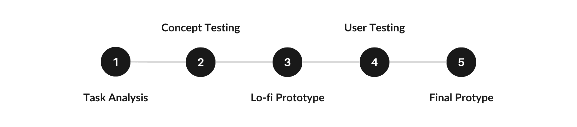
01
__________________
Understand
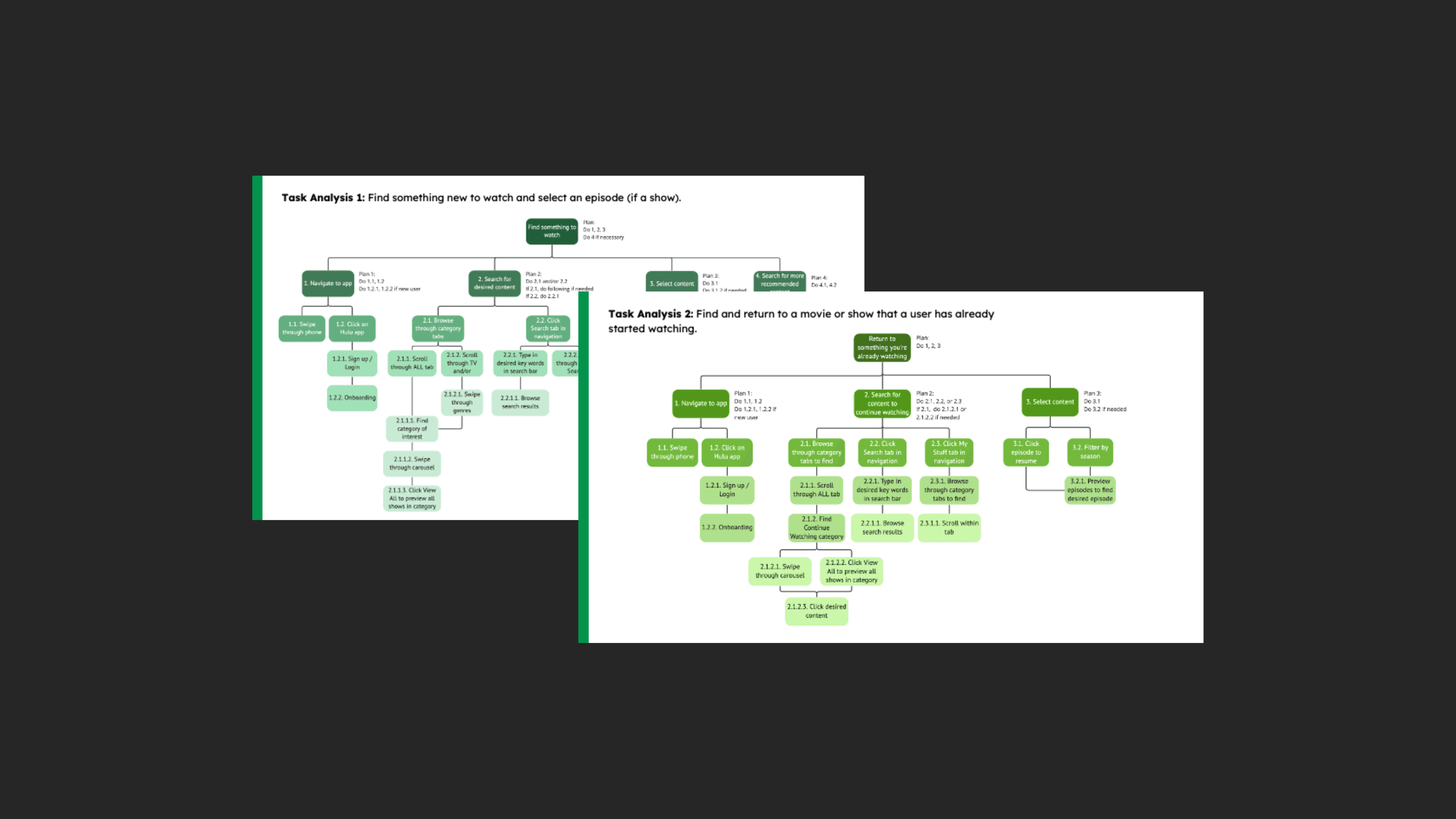
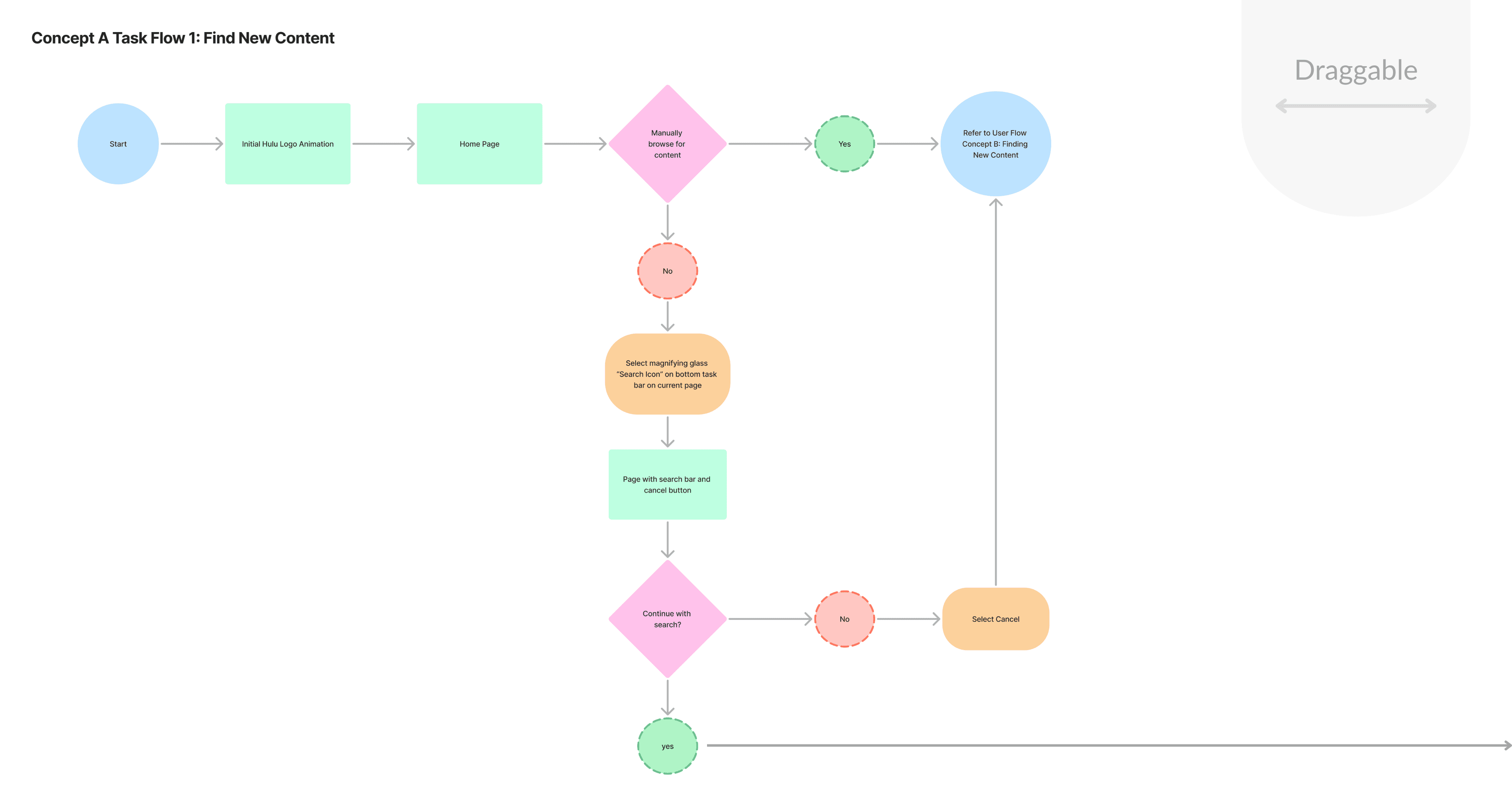
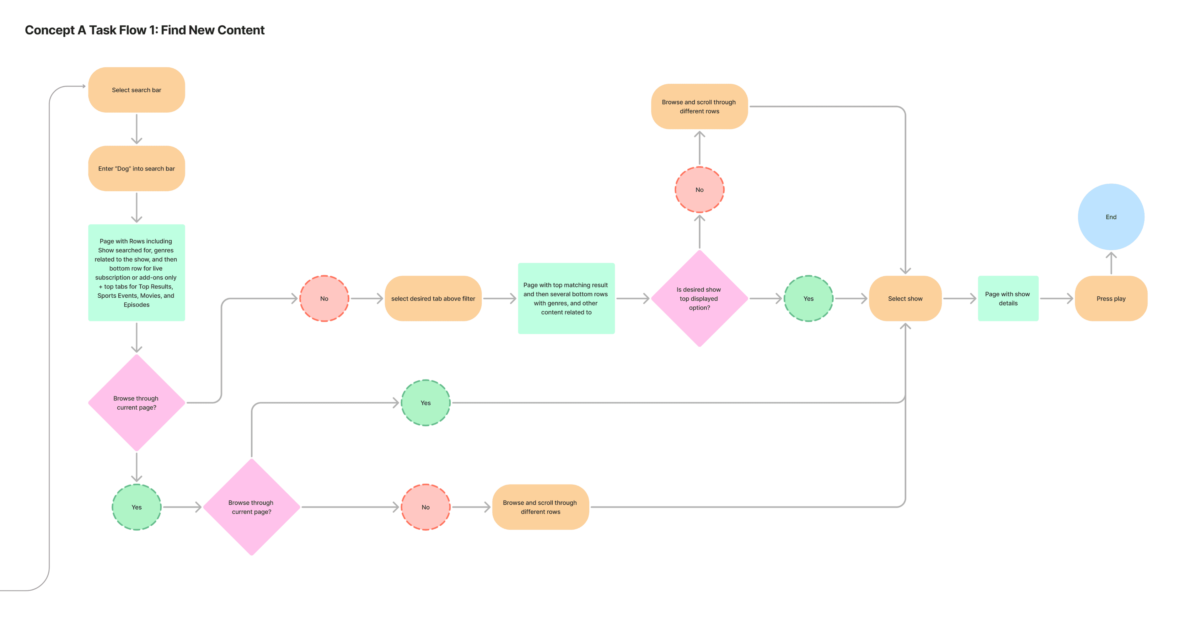
Task Analysis
The target user group for this redesign was university students, who comprise a significant portion of Hulu's subscriber base. Research revealed that these users value efficiency, instant gratification, and ease of use, especially given their limited recreational time and budget constraints. Many students use Hulu's ad-supported plan, which offers a lower-cost subscription but comes with navigational challenges and unintuitive design elements.
To better understand user behavior, we conducted a task analysis focusing on two core Hulu user flows:
Finding New Content: Users browse or search for new shows or movies to watch.
Returning to Content: Users resume watching a show or movie they’ve already started.
Our findings revealed that
Users found the search functionality effective but were frustrated by the lack of filtering options and the presence of locked content.
The "Continue Watching" section was often buried under recommendations, making it difficult for users to resume content quickly.
Users expressed confusion over the "My Stuff" tab, which was not pre-populated with shows they had already watched.
The manual browsing experience was tedious, with too much vertical scrolling and inconsistent card sizes.
User Testing
User Testing
Qualitative data was central to this project. Within the project's defined scope and limitations, focused user group sessions were conducted regularly to inform our design decisions.
Qualitative data was central to this project. Within the project's defined scope and limitations, focused user group sessions were conducted regularly to inform our design decisions.
Ideation
The ideation phase focused on addressing key pain points from user research and task analysis, such as excessive scrolling, buried "Continue Watching" sections, and a lack of filtering options.
Our goal was to create a more efficient, personalized, and intuitive browsing experience for Hulu’s mobile app, particularly for university students.
We began by individually creating new user flows for Hulu’s core tasks:
Finding something to watch and selecting an episode, and
Returning to a movie or show already in progress. This resulted in three initial ideas for each task.

Concept Development

We pivoted here, and chose to update the tasks to account for varying levels of user familiarity with the app, focusing on:
Browsing and finding new content for users without a specific show in mind.
Returning to content that users had already started watching.
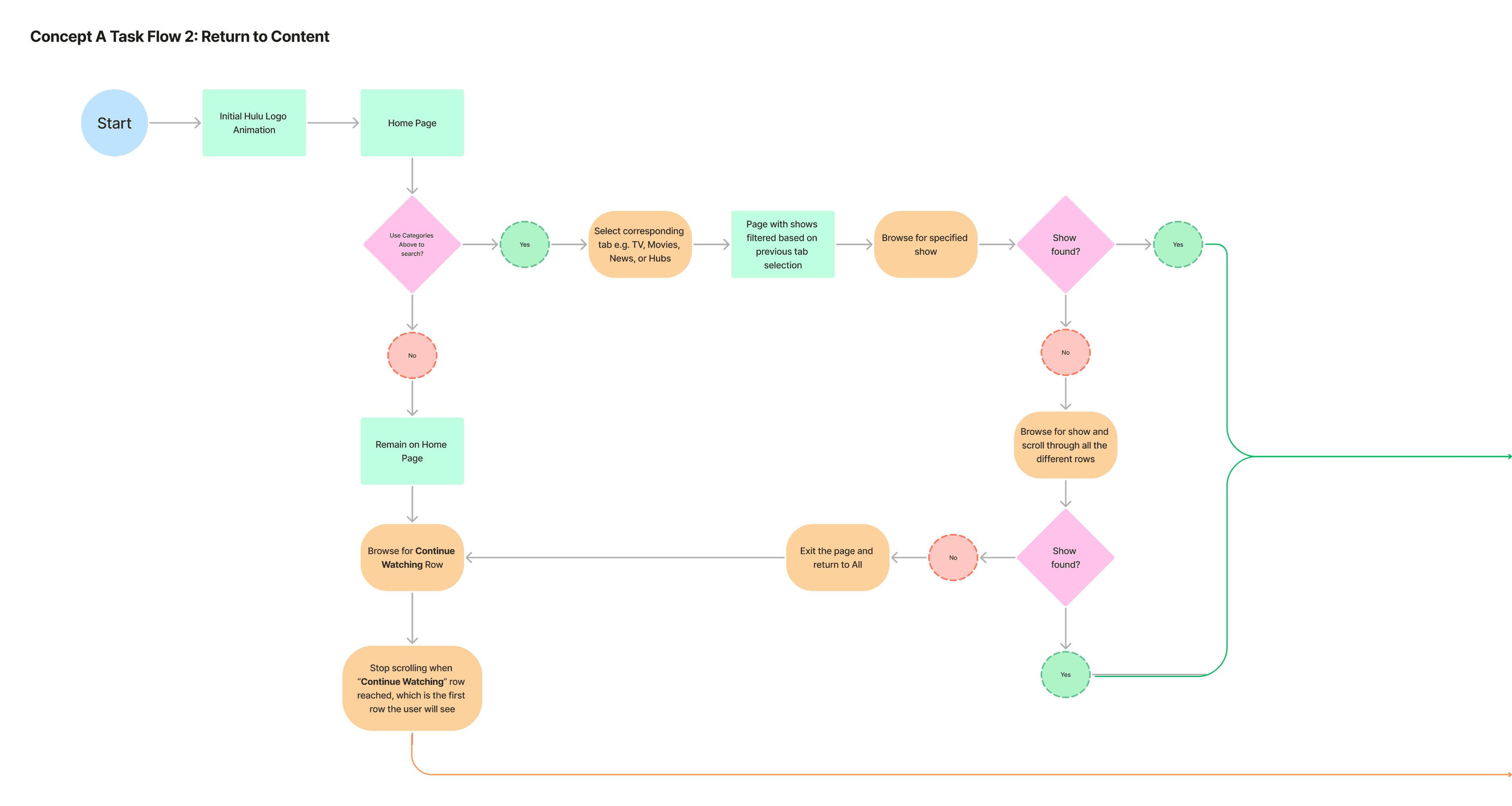
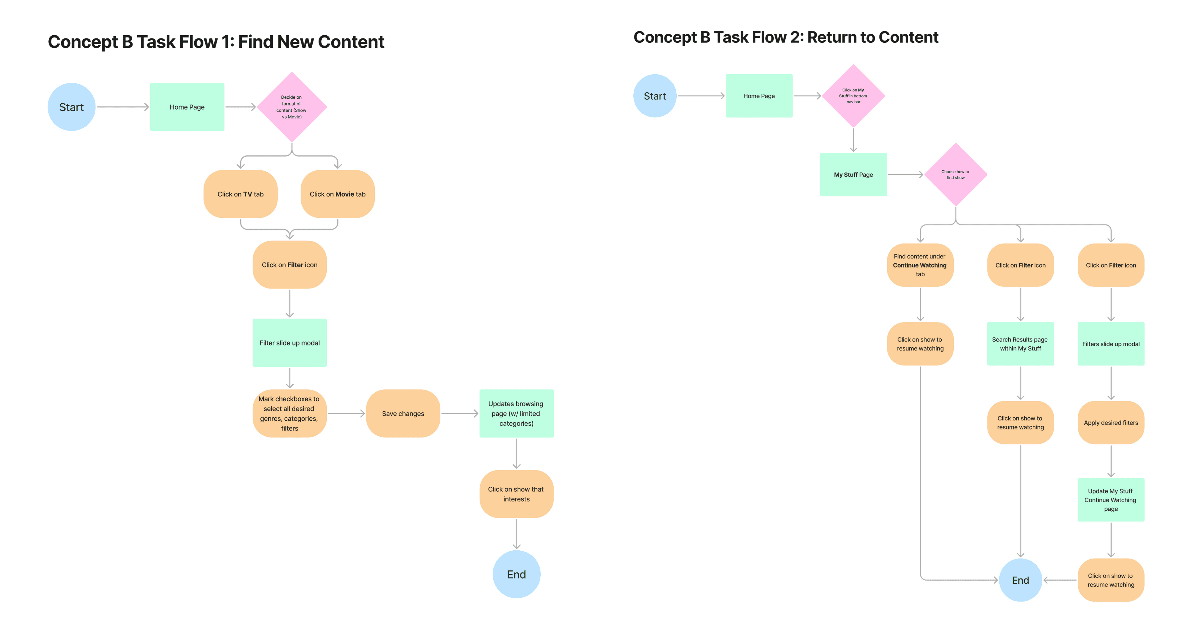
We created user task flows for both concepts.
We pivoted here, and chose to update the tasks to account for varying levels of user familiarity with the app, focusing on:
Browsing and finding new content for users without a specific show in mind.
Returning to content that users had already started watching.
We created user task flows for both concepts.
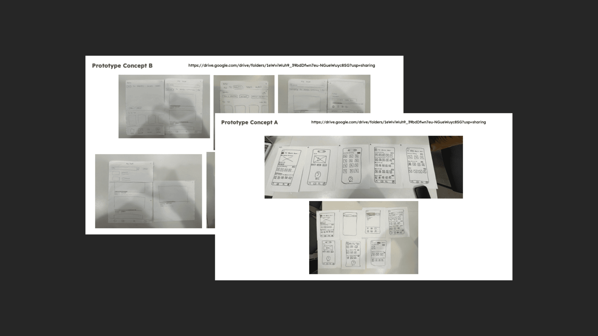
Based on the previous insights and our task flows, we rapid prototype our two primary design concepts with paper:
Concept A: Reorganization of Content
Focused on improving navigation by reorganizing content hierarchies.
Moved the “Continue Watching” section higher on the home screen.
Redesigned search results to match the carousel layout of other browsing screens.
Concept B: Personalization of Content
Introduced filtering and search features to enhance personalization.
Added genre filters to the Movies and TV tabs.
Created a search and filter feature for the “My Stuff” tab.
Heuristic Evaluations
The team developed prototypes for both Concept A and Concept B and conducted heuristic evaluations with university students. The tests revealed that users valued both the reorganization of content and the addition of personalization features. Based on the feedback, the team decided to combine elements from both concepts for the final prototype.
The team developed prototypes for both Concept A and Concept B and conducted heuristic evaluations with university students. The tests revealed that users valued both the reorganization of content and the addition of personalization features. Based on the feedback, the team decided to combine elements from both concepts for the final prototype.
The team developed prototypes for both Concept A and Concept B and conducted heuristic evaluations with university students. The tests revealed that users valued both the reorganization of content and the addition of personalization features. Based on the feedback, the team decided to combine elements from both concepts for the final prototype.
Key Findings from Testing:
Users appreciated the horizontal swiping carousel, which made it easier to browse content without excessive scrolling.
The "Continue Watching" section was more accessible when placed higher on the home screen.
Users found the filter feature helpful but were confused about how multiple genre selections would affect search results.
Some users were unsure about the purpose of the "Saved" tab, suggesting the need for clearer labeling.

02
__________________
Make
Wireframes
Once we established a clear design direction through ideation and concept testing, we developed multiple wireframe variations to refine layout and interaction patterns for an intuitive and efficient user experience.Our low-fidelity wireframes prioritized functionality and user flow, allowing us to experiment with key elements while ensuring efficiency and user freedom to personalize content and navigate the app freely—both of which were greatly valued among the people we tested.
We combined the best elements of both concepts into a single low-fidelity prototype. Key features included:
Reorganized Content Hierarchy: The “Continue Watching” section was moved to the top of the home screen.
Enhanced Filtering: Users could filter content by genre, mood, or recommendations.
Consistent Carousel Layout: Horizontal swiping was maintained across all browsing screens.
Improved “Saved” Tab: The “My Stuff” tab was rebranded as “Saved” and pre-populated with shows users had already watched.

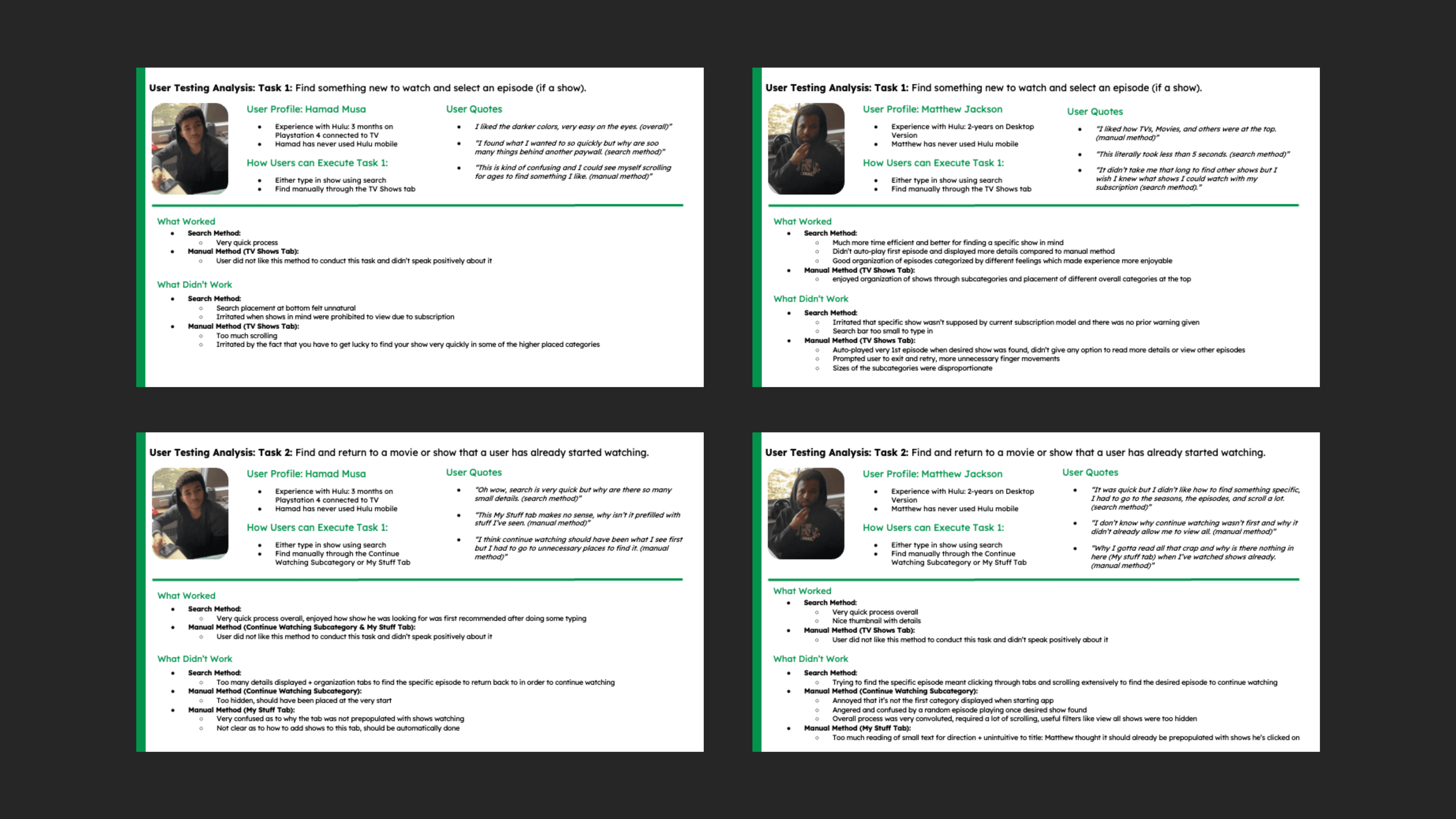
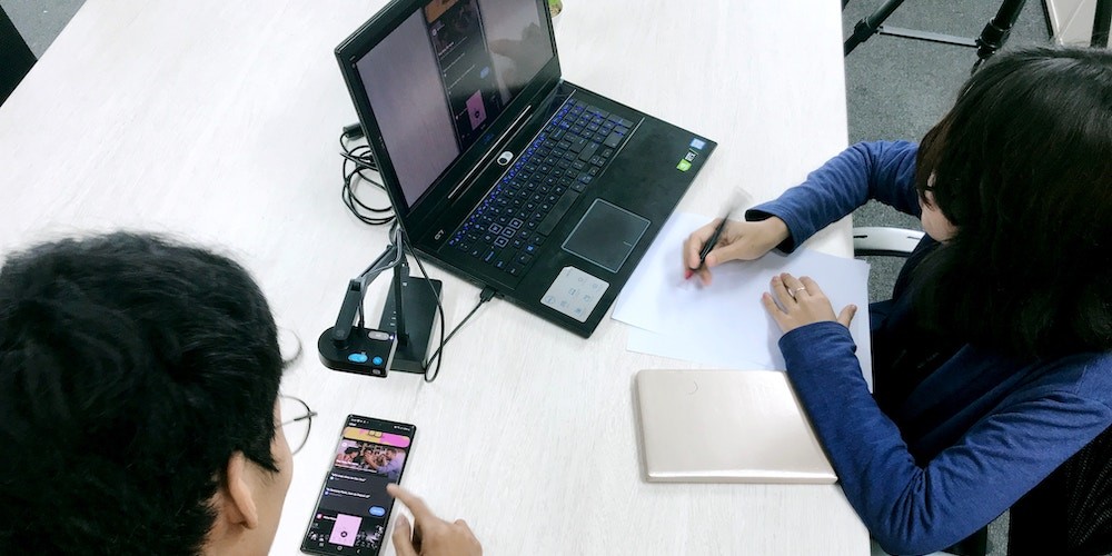
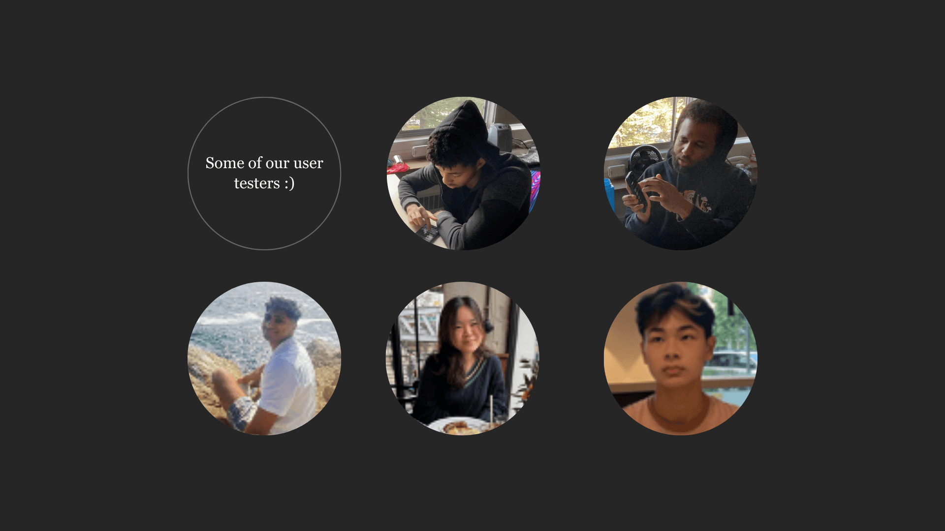
Usability Testing
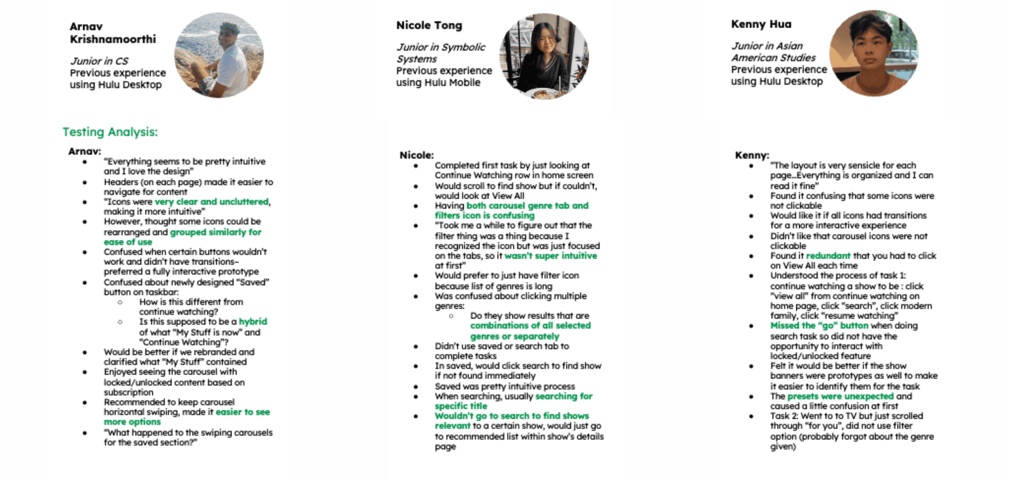
We conducted usability tests with three university students, including both experienced and new Hulu users. The tasks focused on finding new content and returning to previously watched shows..
All tests were conducted on March 12, 2023 inside a Dorm huddle room that was occupied solely by the testers and participants. Participants sat at an empty table with only the mobile device used for testing the prototype. Testers read out the prompt and observed the participants’ engagement with the prototype.
Usability testing Insights
Users found the new layout intuitive and appreciated the reduced scrolling, clear headers and uncluttered icons.
Confusion with Filters and Tabs: Some users were unsure how multiple genre filters would display results. The combination of carousel genre tabs and filter icons was confusing.
Clarity Issues: The “Saved” tab needed clearer labeling to differentiate it from “Continue Watching.”
Efficiency: Users wanted quicker access to "Continue Watching" and less redundancy (e.g., clicking "View All" repeatedly).
Iteration
Based on our usability testing insights, we made several key refinements to enhance clarity, efficiency, and ease of navigation:
Refined Filtering System: To address confusion with multiple genre filters, we streamlined the design by consolidating filter options into a single, clearly labeled dropdown menu. This eliminated the redundancy of carousel genre tabs and improved user comprehension.
Enhanced Tab Clarity: The “Saved” tab was relabeled to “My Library” to better differentiate it from “Continue Watching.” Additional microcopy was added to clarify its function, ensuring users understood its purpose at a glance.
Optimized Navigation for Efficiency: To minimize unnecessary clicks, we introduced a persistent “Continue Watching” section on the homepage, reducing the need for users to repeatedly select “View All.” This change allowed for quicker access to in-progress content while maintaining a clean and organized layout.
These refinements were guided by user feedback, ensuring the final design prioritized intuitive navigation, personalization, and efficiency.
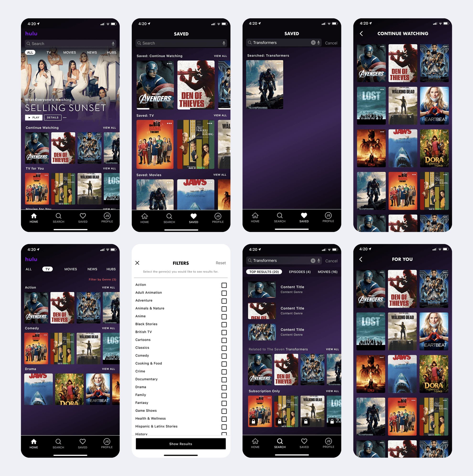
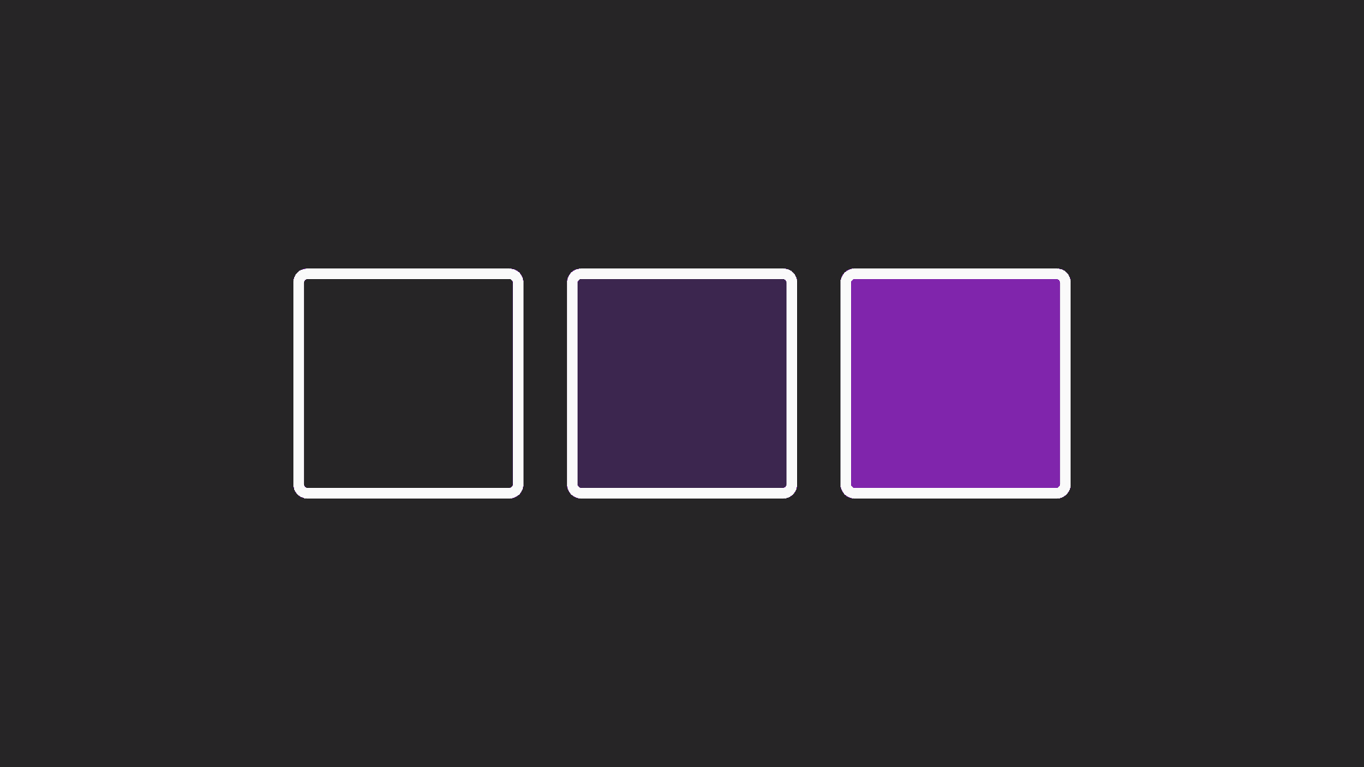
Building on user insights, we reimagined Hulu’s signature green and black color scheme, opting for a bold purple and black theme to enhance engagement and personalization. Purple, often linked to creativity and exclusivity, aligned with our goal of giving users more control over their viewing experience. This shift not only differentiated our design from Hulu’s existing branding but also reinforced a sense of premium curation. Carefully selected for contrast and accessibility, the new palette improved readability while maintaining a sleek, modern aesthetic—encouraging effortless exploration and a deeper sense of ownership over content discovery.
Building on user insights, we reimagined Hulu’s signature green and black color scheme, opting for a bold purple and black theme to enhance engagement and personalization. Purple, often linked to creativity and exclusivity, aligned with our goal of giving users more control over their viewing experience. This shift not only differentiated our design from Hulu’s existing branding but also reinforced a sense of premium curation. Carefully selected for contrast and accessibility, the new palette improved readability while maintaining a sleek, modern aesthetic—encouraging effortless exploration and a deeper sense of ownership over content discovery.
Building on user insights, we reimagined Hulu’s signature green and black color scheme, opting for a bold purple and black theme to enhance engagement and personalization. Purple, often linked to creativity and exclusivity, aligned with our goal of giving users more control over their viewing experience. This shift not only differentiated our design from Hulu’s existing branding but also reinforced a sense of premium curation. Carefully selected for contrast and accessibility, the new palette improved readability while maintaining a sleek, modern aesthetic—encouraging effortless exploration and a deeper sense of ownership over content discovery.
03
__________________
Final Design
Outcome: A More Intuitive Experience
By the end, we had a high-fidelity prototype that addressed the usability pain points of the original Hulu app. Users could now:
Find and resume content faster, thanks to the reorganized home screen and horizontal swiping carousels.
Discover new content more easily, with genre filters and personalized recommendations.
Navigate the app with confidence, thanks to clearer labels and a more intuitive "Saved" tab.